Nigerian Street Buka's Menu - Project 28
Introduction
This week we are finishing up the brand identity for our restaurant. This has definitely been an interesting and knowledgeable process. I cannot stress enough that I have learned a vast amount of information in such a short time, and I have enjoyed designing the brand for Nigerian Street Buka.
One of the projects for this week is to create a menu. I mean,
you cannot have a restaurant that does not have a menu.
While going through the process of creating the menu, I
learned how to use Paragraph and Character styles a bit more in depth. These
two features of Adobe Illustrator make the process of designing projects with
text way more efficient opposed to going in and editing everything piece by
piece. I have also seen what it’s like to have a group of brand identity
products flow together.
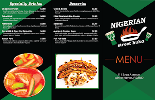
I chose to do a trifold menu. In my menu I kept the consistent color palette of green,
black, red, orange, and white. These colors are highly valued in Nigeria. I
also included the triangles and rectangles which are the geometric shape
elements that I also have kept consistent throughout my brand. Both the color
palette and the shapes bring more of a modern feel to my street restaurant. I
do not want it to come off as too fancy so I kept it simple. The type faces are
also consistent. The same two typefaces appear throughout the whole identity.
On the front of menu, I spent a bit of time trying to figure
how to place the logo, MENU, and the address. I knew I wanted to include the
three of these elements, but I was having some trouble determining how to display
them. I ended up putting two triangles at the bottom. The intersected, and I
lowered the opacity so that you could see the triangle that was made at the
intersection. This helps the address look clearer, and the triangles lead you
to the center. I also put a triangle at the top that leads your eyes down, and
the triangle at the top is the missing piece from the intersected triangles at
the bottom.
Nigerian Street Buka's Menu
Conclusion
The branding process is detailed and it takes a great
portion of brainstorming. I have learned the ideations and brainstorming
process is one of the most important parts of design. By brainstorming and
creating thumbnails a designer saves a lot of time. If you know what you want
something to look like it is easier to get it done in Adobe. I have gotten
faster at designing, and I am proud of my progress. I know there are so many
other things out there for me to learn, but I am satisfied with how my brand
identity for Nigerian Street Buka has come together.


Comments
Post a Comment