Posts

Showing posts with the label Projects

Publix Flowers Facebook Post- Project 32

Image
Introduction      Publix has been in the spotlight for the last two weeks of my course, Graphic Design Portfolio. They are one of the major corporations in the Lakeland area where their headquarters reside. I chose these company based off of their outstanding values and how they portray themselves.      For my last project of the course, I have chosen to create a Facebook post in its correct dimensions. The focal point of this post is flowers. Amongst the plethora of products and services that Publix provides one that may be hidden with the other gems is the floral department. This post is specifically for wedding flowers and arrangements.      This idea came to me rather quickly. I chose a stunning bouquet from their website that I wanted to promote, Amber Romance. I decided to put the picture of the bride holding the bouquet up in the top left corner while the bouquet standing alone is just below it to the right. This showcases the fl...

Publix Full Page Ad - Project 31

Image
Introduction      Publix is more than just a grocery store chain. Well known for its exceptional customer service and high-quality products, Publix has committed to giving back and working within the community, fostering a sense of belonging. Publix also embraces a light-hearted spirit, creating fun customer promotions and activities. While delving into my research on Publix and learning about its brand identity, I stumbled across a section that piqued my interest. Publix has a page on its website devoted to Halloween-related crafts and treats. This page is rightfully named, Creepy, Crafty Fun, and judging by the photos provided, they will definitely make for a great time, especially if you have young children. After discovering this hidden treasure on Publix’s website, I knew my next project would involve Halloween.      My next project is a full-page magazine ad advertising two recipes listed on Publix’s Creepy, Crafty Fun page. I knew that I would in...

Publix Instagram Post - Project 30

Image
Introduction      Publix is a company that places great emphasis on the quality of their products. This stands out in their company in more ways than one. A great contributor to this statement is their GreenWise organic product line. “GreenWise products were created from a shared belief in good, and you can find them throughout our stores. We believe is should be easy to bring home products you can feel good about.” You can visit the link below for more information. Link: https://greenwisemarket.com/greenwise-products      The second project I chose to create this week is a Publix Instagram post that is promoting the GreenWise Ginger Wellness Shot. I am an advocate of these shots. I choose to take a holistic approach with medicine, and these shots are a great asset.      I began this project by brainstorming different pieces that I would like to contribute. In the end, I decided to create an Instagram post with the GreenWise Ginger W...

Publix BOGO Half-Page Ad - Project 29

Image
Introduction      Wrapping it from an exciting and adventurous journey of knowledge pertaining to the world of Graphics Arts and Design, I have arrived at my final destination, Graphic Design Portfolio. Graphic Design Portfolio introduces designers to the highly competitive and unpredictable work force. Here we discuss the how and why we construct cover letters and resumes, along with what to expect when arriving for an interview with a potential employer. It is no secret that the world of graphic design is rapidly evolving, but just as fast as its growth increases, so do our designers.      For one of the projects this week, we are to design a piece that would help us land the job that we have chosen. I chose the Graphic Designer position on the Marketing team at Publix’s corporate office in Lakeland, Fl.      My first project is a Buy 1, Get 1 half-page ad. Publix is well known for their Buy 1, Get 1 deals, and they are heavily advertis...

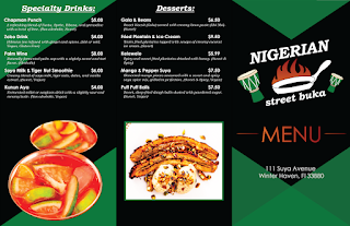
Nigerian Street Buka's Menu - Project 28

Image
Introduction      This week we are finishing up the brand identity for our restaurant. This has definitely been an interesting and knowledgeable process. I cannot stress enough that I have learned a vast amount of information in such a short time, and I have enjoyed designing the brand for Nigerian Street Buka.      One of the projects for this week is to create a menu. I mean, you cannot have a restaurant that does not have a menu.      While going through the process of creating the menu, I learned how to use Paragraph and Character styles a bit more in depth. These two features of Adobe Illustrator make the process of designing projects with text way more efficient opposed to going in and editing everything piece by piece. I have also seen what it’s like to have a group of brand identity products flow together.     I chose to do a trifold menu.  In my menu I kept the consistent color palette of green, black, red, orang...

Nigerian Street Buka's Touchpoints - Project 27

Image
Introduction      To continue with learning about what makes a successful brand identity and how to create one, this week we are to design three more touchpoints that we would consider using for our restaurant.      Now that we are in week three of Intro to Marketing and Self-Promotion , I am beginning to really understand branding and what it takes to have a successful brand. I know I still have a lot to learn, but designing a business from scratch helps teach someone how to go through the process themselves. It gives you a little taste of what it's like. Through-out my travels, I notice that I am zoning in on the brands that are in my environment.      One brand that I was focusing in on was Starbucks . Their name and symbol are everywhere. When you order Starbucks, you have a little piece of their brand in every step of the process. This includes their napkins, straws, coffee sleeves, bags, merchandise, stickers, etc. When you walk ...

Nigerian Street Buka's Brand Identity - Project 26

Image
     Now that a Logo had been established for Nigerian Street Buka , it was time to create a Brand Identity. For this part of the assignment, we were supposed to create a Business Card , Letterhead , Envelope , and a Website Mock-up (For a cell phone screen.) for our restaurant.      I began this project by researching various brand identities and business cards. I wanted to get a feel for what was out there in the world of the restaurant industry. Anyone can come up with a generic design for their brand identity, but if you want your brand identity to speak to your customers visually and emotionally, there needs to be a great portion of brainstorming and planning: colors, shapes, typography, and more need to be taken into careful consideration.      After completing my research, I drew my artboards out for each project piece and began contemplating a few designs. I knew my colors would be a combination of two or three colors that I pick...

Nigerian Street Buka's Logo - Project 25 Final

Image
     Nigerian clothing and street restaurant signs are filled with vibrant and bold colors. Each region's colors vary, but many wear colorful attire at some point.      To begin my logo process, I came up with the name Nigerian Street Buka. I wanted Nigerian and street in the name so that people knew what kind of food it was, but I also wanted it to be unique so I named it Nigerian Street Buka. Buka refers to small local shops in Nigeria, and that is what my restaurant represents. I also knew that I wanted to represent music and food.      Then, I sketched 30 thumbnails, and from the 30 that I sketched, I chose 3 thumbnails. I then created 3 roughs from these thumbnails, adding more detail. I again chose 1 rough for my final design.      I uploaded a photo of my rough to Adobe Illustrator, and I began drawing everything out with the pen tool. As I came to the final logo, I realized that there were some details that I did ...

Nigerian Street Buka - Project 25a

Image
     We have jumped into the first week of Intro to Marketing and Self-Promotion . For the duration of this class, we will be working on the branding process for a restaurant. We will be creating a logo, business cards, letterheads, envelopes, web page mock-ups, touchpoints, a menu, and a branding guide. In this post, we are instructed to describe the restaurant: the food, the atmosphere, the dining experience, the anticipated audience, and anything that makes it unique. We are to think of the vision and mission of the restaurant envisioning the entire dining experience from a first-person point of view.      Welcome to Nigerian Street Buka , you will dive into the culture of Nigerian people, community, food, and music. Vision: Bringing people together, bite by bite and beat by beat celebrating authentic Nigerian heritage. Mission: To provide an authentic, wholesome, and immersive experience by delivering vibrant, rich Nigerian food and lively musi...

Coffee Infographics/Living Green Infographics - Project 24

Image
Introduction      The first part of the project for Digital Illustration is to create 4 infographics with one that is 3-dimensional. This is a project that you follow along with in the book. These infographics are about coffee. Coffee Infographic 1 Coffee Infographic 2 Coffee Infographic 3 Coffee Infographic 4      The last part of the project for Digital Illustration is to create 3 infographics and the illustrations for each of them. The theme of next month’s magazine is “Living Green.” The main topics all focus on renewable energy, recycling strategies, and landfill reduction. The infographics created will coincide with the cover story.      Different methods that are being explored to supply affordable electricity in large metropolitan areas, such as New York and California will be discussed.      The graphs with the data need to be presented in a manner that is clear and understandable so that the readers of...

Self Portrait - Project 23

Image
Introduction      To end the class in what has been a great experience in learning Adobe Illustrator, our professor has assigned us a Final. The final is to create a self-portrait in Adobe Illustrator. We have free range to create the portrait however we see fit.      I can draw portraits of people with led pencil and other mediums, but I have decided to upload a picture of myself instead. I used gradients to make them blend as well. I am still trying to learn how to make it one cohesive piece.      I started by tracing the outside of my hair, and I added some other parts of the hair to make them lighter and darker.      I then started working on my black t-shirt, and I did the same thing.      After I finished the shirt, I began the journey of my face. The face has taken me the longest to do. I outlined it, and then I started on the eyes.      With the eyes, I used radial repeat to get...

AOS/The Painted Turtle Brochures - Project 22

Image
Introduction      The second project for this week involved making a brochure. In the book, Against The Clock , a brochure needed to be made for the event The Art Of Science The Spotlight Exhibition Series .      The book walks you through how to do this project, and it provides you with logos, text, and images that the client wants in their brochure. It then tells you where to place them, and it teaches you how to make the template for the brochure. AOS Final Product      The next portion of this project is to create the project at the end of the chapter, and the client is The Painted Turtle. The Painted Turtle needs a fundraising brochure made including images, logos, contact information, information about the fundraiser, background information, and a donation sheet.      They had a fire, and the fire destroyed a large portion of their camp. They are raising money to rebuild it so their campers to return to their ha...

Greed - Project 21

Image
Introduction      Our third week of Digital Illustration has almost come to an end, and I have finished my 21 here at Keiser University. This week’s project is to pick one of the Seven Deadly Sins : Greed, Wrath, Sloth, Gluttony, Pride, Lust, or Envy . The Deadly Sins would all be interesting to depict considering we have the creative freedom to do whatever we want with this project just as long as we put some deep thought and effort into it. The Deadly Sin that I have chosen is GREED .      Greed consumes many people daily, and the need for Greed can also consume you causing you to live a life that you may not be able to afford. It can also have you dreaming of a fantasy life that doesn’t exist neglecting the life that you do presently have.      Then others have so much wealth that they do not know what to do with it, meanwhile, there are so many who struggle on a daily basis.      After doing some research the c...

Bonnaroo Event Poster - Project 20

Image
Introduction      The second project for this week was to create an event poster for a real-life event. The only specification for this was to use expressive typography and that the event be real.      The event I chose to complete a poster for was Bonnaroo . Bonnaroo is a famous Music & Arts Festival , and people travel from all over to come and see the bands that perform. Bonnaroo is put on in Manchester, Tennessee .        Bonnaroo is unique because they schedule a plethora of different artists to perform on stage ranging from majorly famous artists listed as the headliners to small, indie, underground artists that most people would not recognize.      For this event, you can get a hotel for lodging, but a majority of attendees sleep in a tent right on the grounds. There are showers and bathrooms provided, and you can come and go as you please (even though it is not recommended.      I have...

Cincinnati Zoo Logo, Icons, and Invitation - Project 19

Image
Introduction      In the first portion of this project, we had to complete a logo for Cafe Limon. We were to follow along with the book to create 3 different designs for the logo, and the 2 of the designs would go on a letterhead and envelope that we made. Cafe Limon Finals Designs:     For the second portion of the project, our c lient is the Cincinnati Zoo .      This Cincinnati Zoo is rebranding everything in their zoo, and next spring, they are going to have a Grand Reopening.      We must recreate their logo , come up with a series of icons for each of the zoo’s seven main sections: Tropics, Desert, Arctic, Forest, Ocean, Sky, and Kids Kingdom, and create an invitation for the Grand Reopening celebration that includes the new logo.      We are to research the proper size of the invitation that will be sent through the U.S. Postal Service and include the date, time, phone number, and web address. ...